Menu
A practice identity, audited a year after delivery, and corrected in the files.
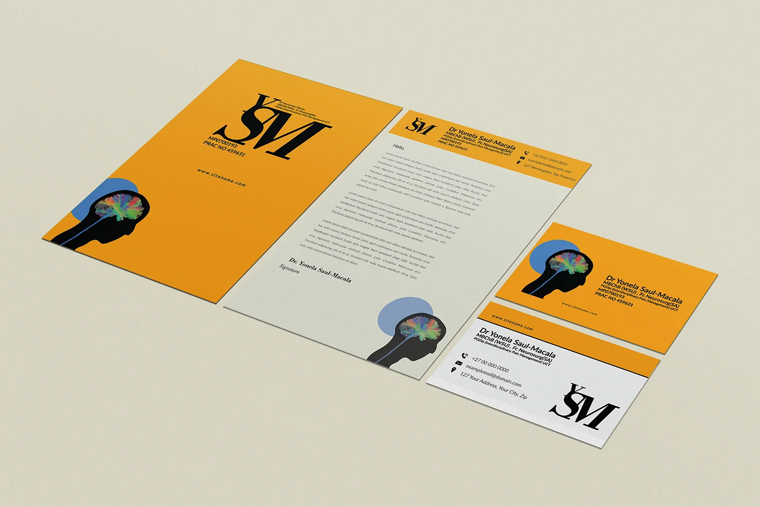
Six pieces of stationery, delivered between November 2024 and March 2025. Each one looked right on its own. Laid side by side, they disagreed.
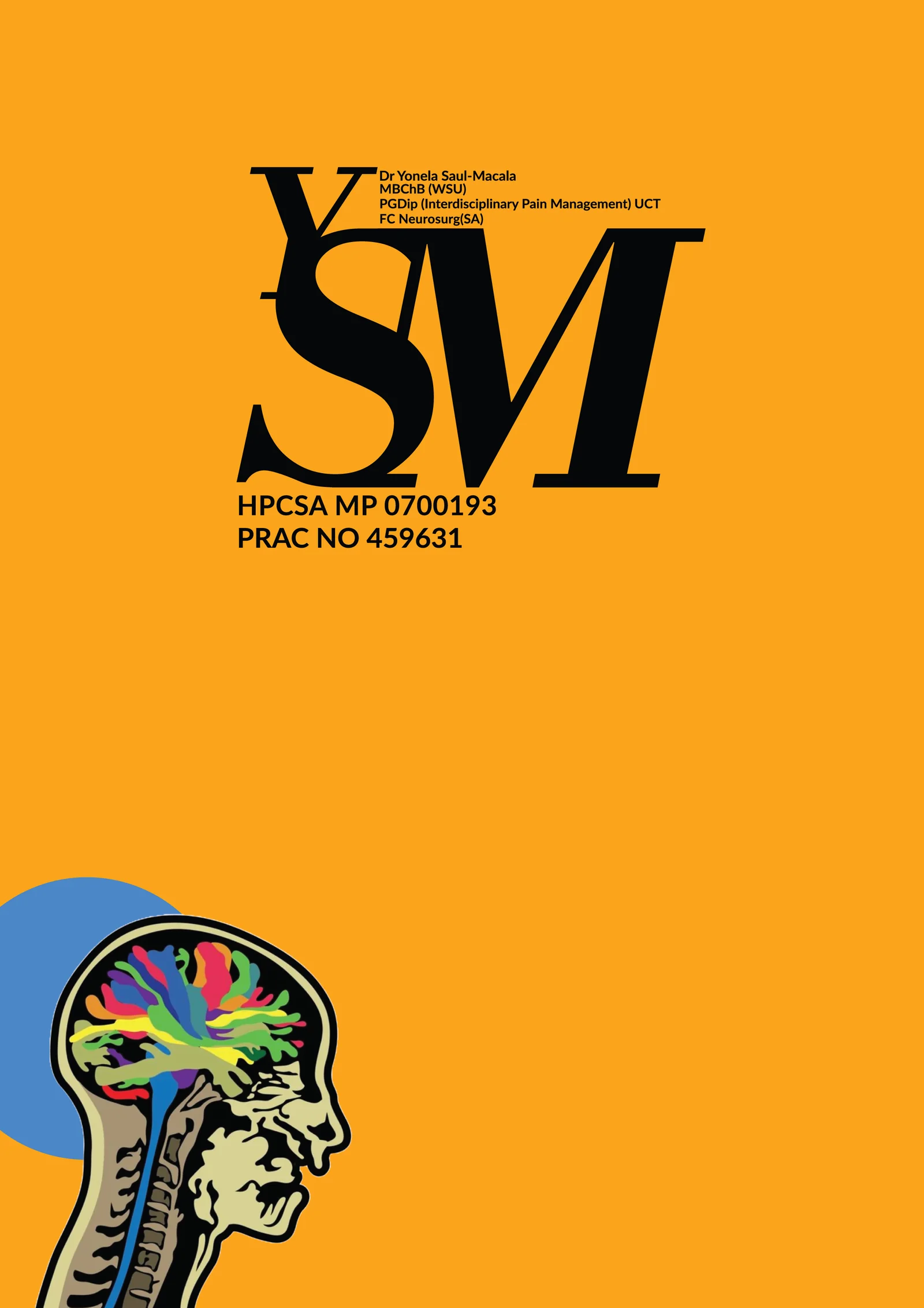
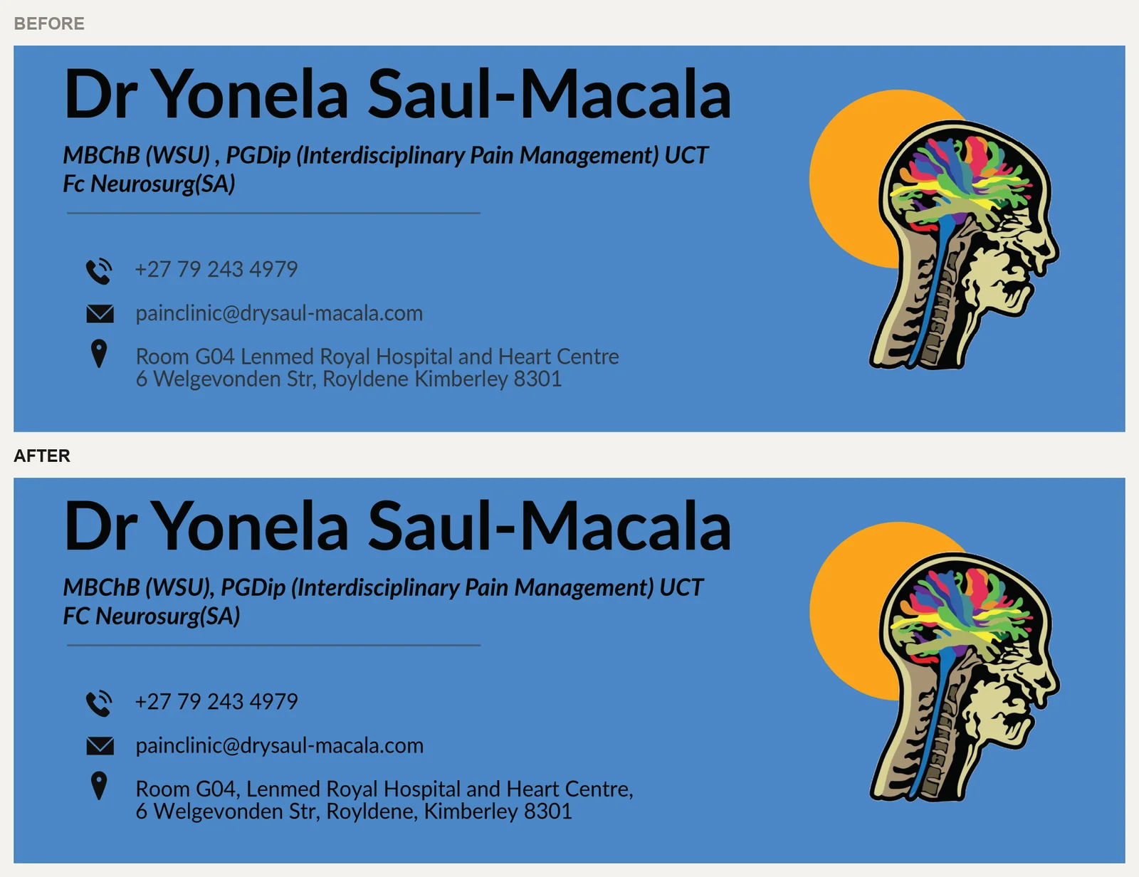
Her qualifications were typed three different ways. One piece used "Fc" and another "FC". One placed the fellowship before the diploma, another after it. The address was punctuated differently on the card. The medical certificate still carried an earlier version of the mark that every other piece had dropped. The letterhead used a lighter blue than the colour specified. None of these would stop a patient. Together, they are the reason an identity starts to look unreliable without anyone being able to say why.
These were my own files. That is the point of this case study.
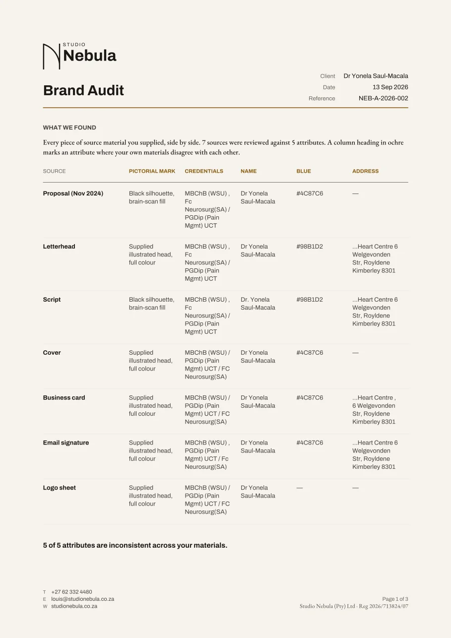
Every piece is one row and every attribute is one column. Where the pieces disagree, the column is flagged. The disagreements are computed from what each file actually shows; nobody types them into the table, so it cannot miss one. Seven sources, five attributes, and all five disagreed.
The table turns "it feels a bit off" into five decisions:
Every colour pairing in the identity was measured against WCAG AA, which requires 4.5:1 for normal text. One pairing failed. The contact details on the blue email signature measured 3.21:1. The orange version of the same signature passed, so the fault was one colour choice on one artboard, and it was invisible until it was measured. Set in the near-black ink the name already uses, it now measures 5.37:1.
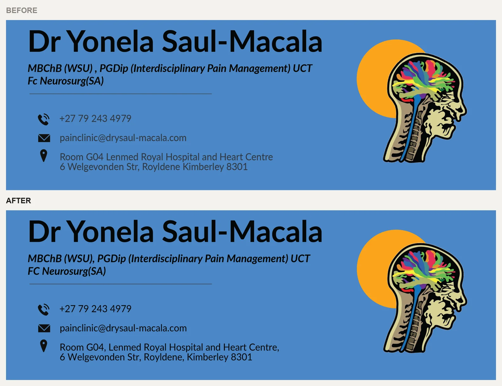
Every change was made in the original Illustrator files and re-exported under the same file names, so nothing that points at them breaks: printer PDFs with their 5 mm bleed intact, EPS, PNG, SVG, the Word letterhead, and the fillable certificate.
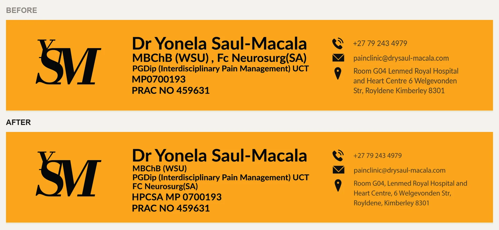
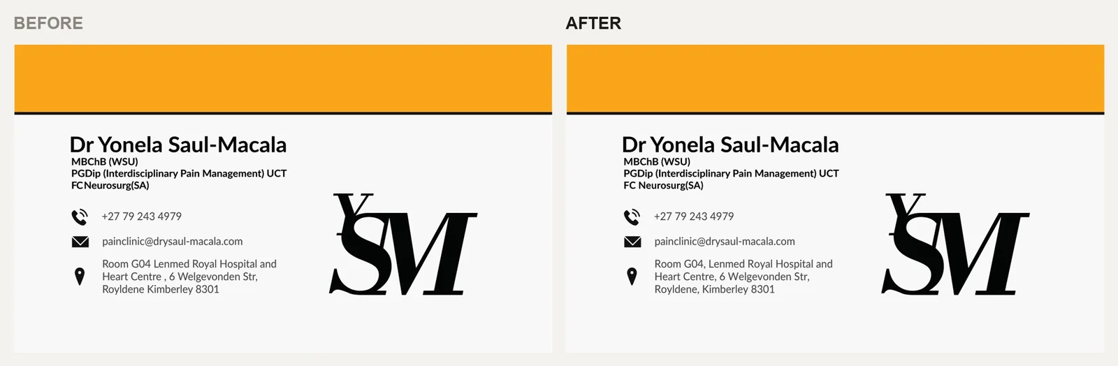
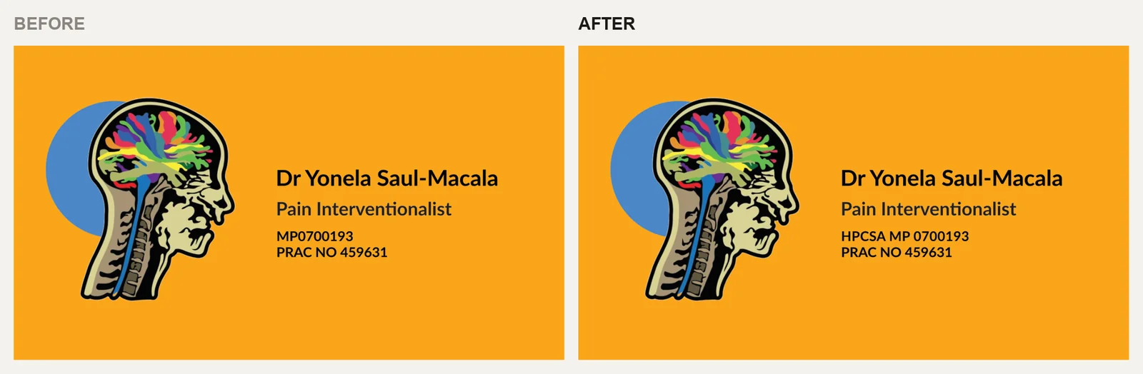
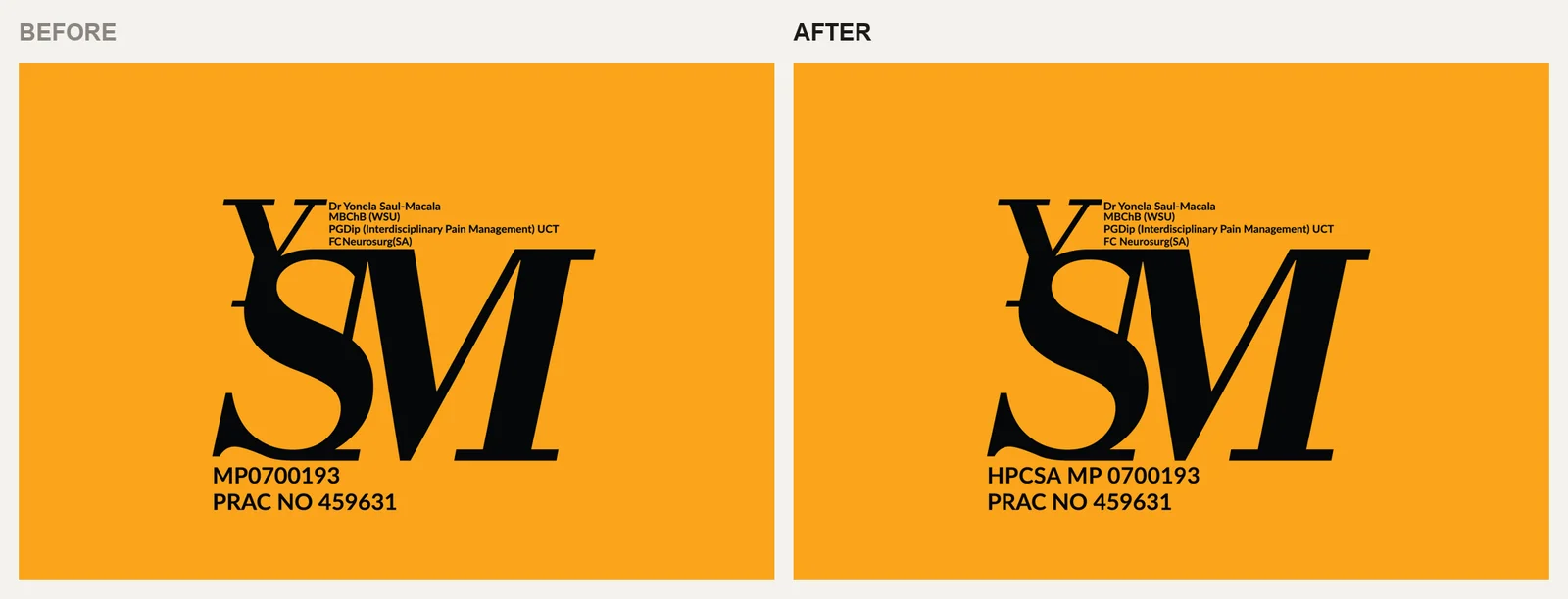
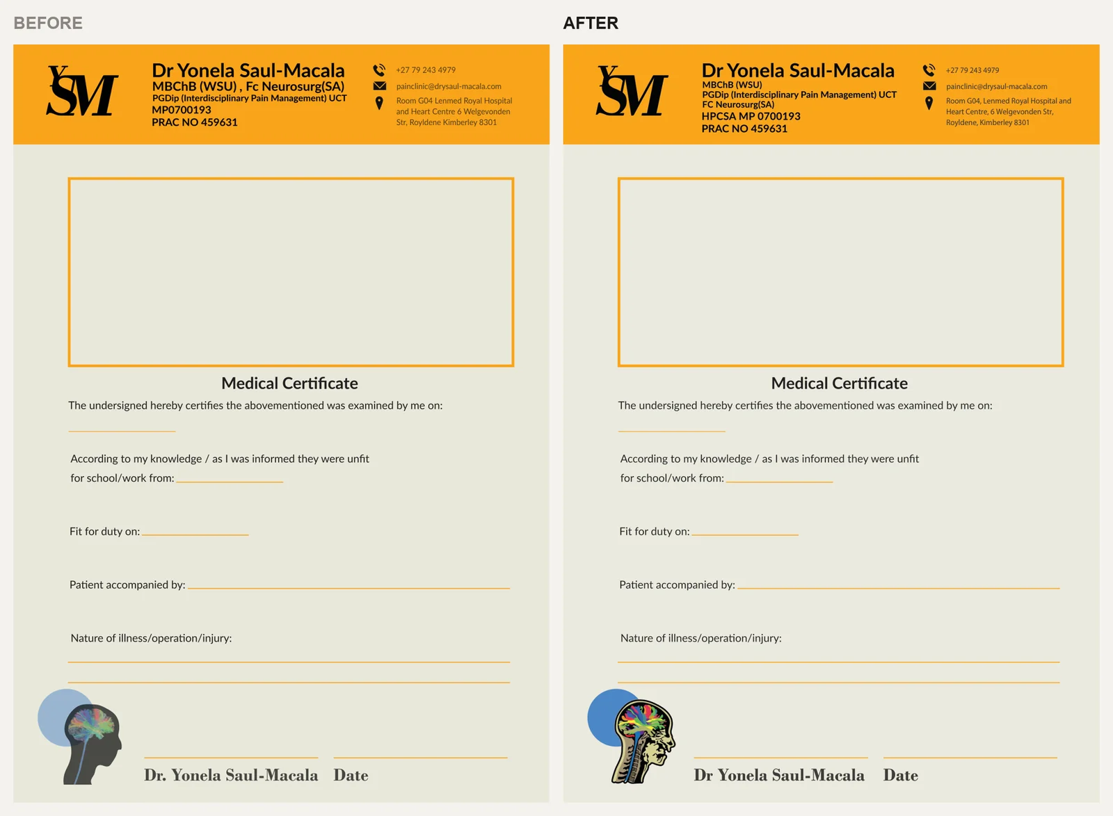
A patient sees your letterhead, your certificate and your email signature in the same week. When they agree, nobody notices, and that is the job. When they don't, the practice looks less careful than it is.
The audit that found this is the first step of every Nebula engagement: Brand Audit, R3,500, credited in full against any identity booked within 30 days.